

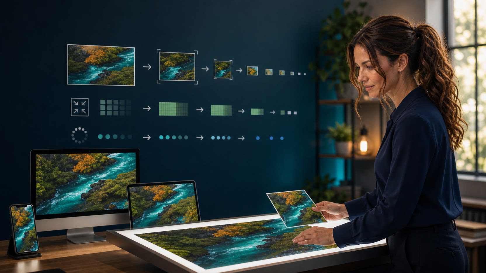
Good WordPress image optimization is not “make every file tiny.” It is delivering a sharp, correctly cropped image at an appropriate size, in a suitable format, when the page actually needs it. WordPress can generate responsive image choices automatically, but the browser still depends on accurate dimensions, sensible layout hints, and an editorial workflow that protects the image’s meaning.
What WordPress already does for responsive images
When an image is managed as a WordPress attachment, WordPress normally creates several intermediate sizes. Its image markup can include srcset, which lists available image candidates, and sizes, which tells the browser how wide the image is expected to appear in the layout. The browser then chooses a candidate based on the available space and the screen’s pixel density.
That is more useful than serving the same giant upload to every visitor. A phone may receive a smaller derivative while a wide, high-density display receives a larger one. It also explains why checking only the original upload can be misleading: the browser may never use that file on the page you are testing.
Who image optimization helps—and what it will not fix
Likely affected
- WordPress sites using large camera originals for heroes, cards, or product photos
- Pages whose mobile browser selects a much larger image than the rendered slot needs
- Layouts that jump because image dimensions or stable aspect ratios are missing
- First-screen images delayed by blanket lazy-loading rules
- Important faces, labels, controls, or disclosures clipped by one-size-fits-all crops
May not be an image problem
- A slow server, database query, DNS lookup, or uncached dynamic page
- Blocking scripts, fonts, ads, consent tools, chat widgets, or analytics loaders
- A third-party image that WordPress does not control
- A CDN or cache serving stale markup after a correct image replacement
- A network outage or weak Wi-Fi connection that slows every page asset
Use the browser’s network and rendering tools to identify the actual bottleneck before installing another optimizer. Improving image delivery can remove real waste, but it cannot repair an unrelated server, script, database, or connectivity problem.
The four decisions that matter most
Match the delivered image to the slot
Start with the image’s rendered width, not an arbitrary universal upload limit. A full-width hero, a two-column card, a small author portrait, and a product gallery need different source sizes. High-density screens may need more physical pixels than the CSS width, but “retina” is not permission to send the original everywhere.
Inspect the public image’s currentSrc, natural dimensions, rendered dimensions, and device-pixel ratio. A modest difference is normal because WordPress can choose only from the derivatives that exist. A repeatedly enormous difference is a clue that the layout hint or available sizes deserve review.
Choose by content and workflow
JPEG remains practical for photographs and broad compatibility. PNG is useful when lossless detail or transparency is important, but it can be expensive for large photos. WebP often provides a strong balance for photographs and graphics. WordPress also supports AVIF when the server’s image-processing library supports it.
Do not choose a format by badge alone. Compare visual quality and the generated derivatives. Screenshots, logos, transparent graphics, photographs, and text-heavy artwork behave differently. AVIF support also does not mean a site should bulk-convert its entire Media Library without testing editing, backups, social previews, and rollback.
Load according to page position
Native loading="lazy" can delay an image that begins off screen until the visitor approaches it. That can reduce unnecessary early network work without a separate lazy-loading script. It is a good starting point for below-the-fold figures and later article-card images.
Do not lazy-load a likely first-screen hero or other probable Largest Contentful Paint image. The browser cannot display an image it has been told to delay. A measured key image may benefit from higher fetch priority, but marking every logo, hero, card, and thumbnail as high priority only makes them compete.
Protect crop, context, and alternatives
Compression keeps the composition; art direction changes it. A desktop panorama can become useless on a phone if the important subject, warning, product control, or disclosure sits near an edge. Keep essential content inside safe margins and inspect the responsive derivative selected by the browser.
Alternative text should match the image’s purpose. Informative images convey the essential point; decorative images normally use an empty alternative; functional images name the action. Charts, instructions, and complex screenshots still need their material information in nearby HTML text or a real table.
Use intrinsic dimensions to reduce layout shifts
An image’s width and height attributes allow the browser to calculate an aspect ratio before the file finishes loading. That gives the layout space to reserve and reduces the chance that paragraphs, buttons, or ads suddenly jump when the image arrives.
This does not require a rigid visual height. Responsive CSS can still let the image scale with its container. The safer pattern is intrinsic geometry plus fluid sizing, not a fixed-height box that clips content at a narrow width or under text zoom.
object-fit: cover can make a row of cards look tidy while silently cutting off faces, labels, disclosure text, screenshots, or product details. Use it only when the component has a deliberate crop rule and the important subject survives every supported viewport.
A practical format and use-case guide
Phone readers: swipe the table left to compare every column.
| Need | Good starting point | Check before publishing | Common mistake |
|---|---|---|---|
| Editorial photograph | JPEG, WebP, or tested AVIF | Visible quality, derivative bytes, crop, and selected source | Uploading a camera-original file and assuming WordPress will solve every layout |
| Screenshot or UI tutorial | PNG or WebP, depending on detail and transparency | Small text clarity, exact controls, zoom, and a textual step equivalent | Compressing until labels blur or making the screenshot the only instruction |
| Logo or simple icon | SVG when trusted and safely handled, otherwise transparent PNG/WebP | Sharp rendering, accessible purpose, theme support, and safe upload policy | Using a large raster logo or repeating decorative icons as noisy alt text |
| Featured hero | Article-specific 16:9 source with responsive derivatives | Safe margins, mobile crop, loading priority, caption/disclosure, and identity continuity | Lazy-loading the likely LCP image or putting critical words at the edge |
| Chart or diagram | Responsive figure plus nearby HTML summary or data table | Legibility on mobile, source/date, alt purpose, and complete text equivalent | Encoding the only copy of facts or instructions inside pixels |
A 12-step WordPress image workflow
- Define the job: hero, card, screenshot, product image, logo, portrait, or decorative accent.
- Inspect the real source: dimensions, aspect ratio, transparency, visible text, and important subjects.
- Choose a crop family: protect faces, device controls, titles, and disclosures with safe margins.
- Export at a sensible source size: large enough for the intended slot and high-density screens, not an untouched camera original by habit.
- Compare formats visually: judge the actual content at its intended display size, not only the smallest byte count.
- Upload through the Media Library: preserve attachment metadata and responsive derivative generation.
- Write purpose-based alt text: describe the information or action; use an empty alternative for decoration.
- Add a useful caption when needed: credit, source, date, disclosure, or context—not a duplicate of the alt text.
- Confirm intrinsic geometry: public markup should retain enough information to reserve the correct aspect ratio.
- Set loading by position: keep likely first-screen/LCP media discoverable; lazy-load genuinely later images.
- Inspect desktop and mobile: check
currentSrc, crop, natural and rendered dimensions, sharpness, and horizontal overflow. - Keep rollback: retain the prior attachment or content reference until the replacement passes public checks.
What not to do
- Do not install an optimizer simply because a scan says “images.” First identify whether the problem is source dimensions, derivative selection, format, loading priority, cache/CDN behavior, or a third-party image.
- Do not preload every hero. Preloads can duplicate work or compete with CSS, fonts, and the image that is actually most important.
- Do not lazy-load everything. Delaying the first meaningful image can make the page feel slower.
- Do not regenerate the entire Media Library casually. It is a write-heavy operation that can consume storage, create unexpected files, and complicate rollback.
- Do not replace text with artwork. Headings, warnings, prices, instructions, and comparison data should remain readable, selectable HTML.
- Do not promise rankings or perfect Core Web Vitals. Image work can remove specific waste or instability, but real outcomes require measurement.
Frequently asked questions
What is the best image size for WordPress?
There is no single best size. The right source depends on the largest intended display slot, supported crop, and screen density. A full-width hero needs more pixels than a 300-pixel card thumbnail. Inspect the browser-selected derivative rather than using one universal number.
Should every WordPress image be WebP or AVIF?
No. Both can be efficient, but content type, visual quality, transparency, server support, derivative generation, editing, backups, and publishing integrations matter. Test representative files and keep a reversible workflow.
Does WordPress automatically resize images for phones?
WordPress normally generates multiple sizes and can publish responsive candidates. The browser selects among them, but accuracy still depends on the image being attachment-backed, suitable sizes existing, and the layout hint matching the real slot.
Should the featured image use lazy loading?
Usually not when it appears in the first viewport and is a likely LCP candidate. Confirm the rendered page and measure rather than making a site-wide assumption, because some templates place the title or other content ahead of the image.
Will smaller images always make a website faster?
Smaller transfers can help, but a blurry crop, late discovery, missing dimensions, or an oversized selected derivative can still produce a poor result. Optimize delivery, layout stability, visual quality, and meaning together.
Primary sources
Guidance and links were rechecked on August 21, 2026.
Related guides from The IT Guys
- WordPress caching explained: why one cache plugin does not fix every slow site
- Website accessibility basics: 10 practical checks for small businesses
Your next action: test one real page
Choose one important public page and record its hero image’s rendered width, currentSrc, natural dimensions, file format, alt text, and behavior at desktop and 390-pixel mobile widths. If the browser downloads an unnecessarily large file, the crop loses meaning, or the page shifts while the image loads, fix that single component first and keep the prior attachment until the replacement passes.